0:00
0:00
Speed
 By Ummima Mushtaq · September 29, 2026 · 25 min read
A homepage is the hardest-working page on any website, and it is also the page most businesses think about least. It gets the most visitors, carries the most decisions, and is usually built last, from whatever copy and images are left over. That is backwards. The homepage is the one page that has to answer three questions in five seconds — what do you do, who is it for, and what should I do next — and then prove the answers before the visitor scrolls away. Most homepages fail at least one of those three, and the failure is rarely the design. It is the decisions behind the design: too many messages, no proof, no next step, and nobody measuring whether any of it works. This guide is about crafting a modern homepage that does the job — the five-second test, the sections that earn their place, the ones that do not, and how to measure whether it works. I run an SEO agency that serves clients worldwide, and I have rebuilt more homepages than I can count — including our own, more than once — and the pattern is always the same: the homepages that convert are not the prettiest ones. They are the clearest ones. Wikipedia describes a homepage as the main web page of a website, and that is exactly the problem: it is the main page, so everything gets put on it, and a page that tries to say everything says nothing.
One honest fact before the method: this page has only ever ranked for our own brand name. In the last 28 days it appeared in search 27 times, and every one of those was for “onyxgrowthlabs.com” — someone typing our name to find us. The phrase crafting a modern homepage has never brought this page a single impression. That is not a surprise. The old version of this page was written about homepages in general and targeted at no search in particular. This rewrite is the first time the page is built around the phrase properly — the same discipline this guide teaches: decide what the page is for, say it plainly, and then prove it.
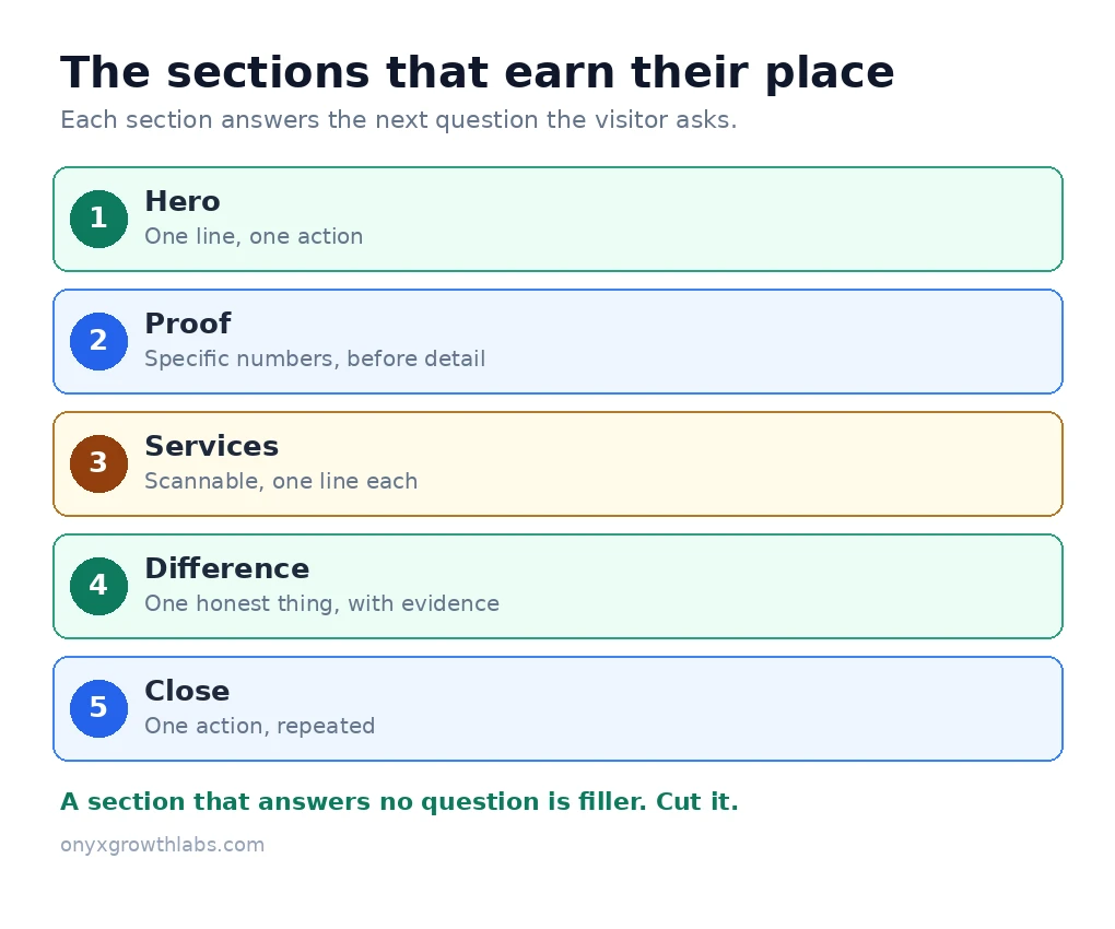
The short answer is a test and an order. The test: show a stranger your homepage for five seconds, hide it, and ask four questions — what does this company do, who is it for, why might you trust it, and what would you do next? If the stranger cannot answer all four, the homepage is not finished, whatever it looks like. The order: the hero says what you do in one line with one action; the proof comes next, before the detail, because a visitor who does not trust you will not read about you; then the services, scannable and short; then what makes you different, stated plainly; then the close, which repeats the one action with a reason to act now. That is the whole page. Everything else is either supporting that order or getting in its way.
The reason the order matters is that a homepage is a sales conversation, not a brochure. A brochure lists everything and lets the reader choose. A conversation goes in order: hook, proof, detail, close. The visitor arrives with a question and leaves with either an answer or a reason to stay, and the page decides which one in the first screen. A homepage that opens with the company history, a mission statement, or a wall of services is a page that answers the questions nobody asked, in the order nobody wanted. Start with the visitor’s question, not yours.
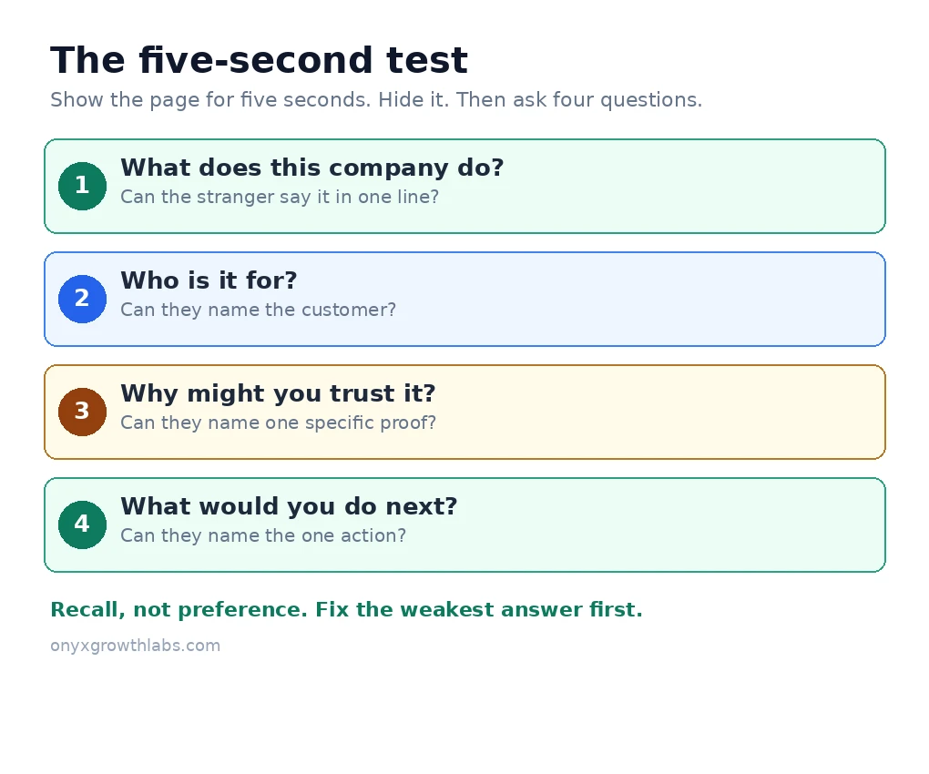
The five-second test is the most useful tool in this guide, and it is also the most misunderstood. It is not a slogan about attention spans, and it is not a test of whether people like your homepage. It is a recall test: show the page to someone who knows nothing about the business for five seconds, take it away, and ask what they remember. Do not ask whether they liked it. Preference produces opinions. Recall reveals whether the page communicated. If the stranger says “something about digital growth, I think” and cannot name the service, the audience, or the next step, the page failed — and the failure is specific enough to fix, because the test tells you which of the four questions went unanswered.
Run the test properly, because a sloppy version of it tells you nothing. Use a stranger, not a colleague — your team already knows what the company does, so they will read the answer into a page that does not say it. Use the real page, on a phone, because that is how most visitors will meet it. Show it for five seconds, no more, and then ask the four questions in plain words: what does this company do, who is it for, why might you trust it, and what would you do next? Score each answer simply: clear, partial, or absent. Then fix the weakest one first, because the four questions are a sequence — a visitor who cannot tell what you do will never reach the question of whether to trust you, and a visitor who cannot tell what to do next will leave with the answer and no action.
The test also settles arguments that design reviews never settle. A founder who loves a clever headline will defend it in a meeting for an hour; a stranger who cannot repeat it after five seconds ends the argument in five seconds. That is the point. The test removes the context the team brings to the page — the knowledge of what the company does, the memory of the meeting where the headline was chosen, the affection for the photograph — and leaves only what a visitor actually gets. If the page passes with strangers, it will pass with customers. If it only passes with people who already know the answer, it is not a homepage. It is an inside joke.
The hero is the first screen, and it has one job: one line that says what you do and who it is for, one supporting line that adds the specific benefit, and one action. That is all. The most common homepage mistake is trying to say everything at once — six headlines, four buttons, a wall of services — and the result is a visitor who sees everything and understands nothing. Pick one primary message: the single outcome you sell. For an agency, that might be “SEO services that turn search into revenue for UK businesses.” Every element on the page should support that message. Secondary services, team bios, and company history belong on deeper pages, not above the fold.
Write the headline for a stranger, not for yourself. Industry jargon means nothing to a business owner searching for help — “full-funnel growth partner”, “digital experiences”, “solutions for modern businesses” could describe hundreds of companies, and a headline that could describe hundreds of companies describes none of them. Say what you do and who it is for, in the words the customer uses. A headline that names the service, the audience and the outcome — “SEO for dental practices that want more patients from Google” — does more work in ten words than a clever phrase does in a paragraph. And the action matters as much as the line: one primary call to action, phrased as what the visitor gets, not what they must do. “Get your free audit” tells the visitor what happens next. “Learn more” tells them nothing, and it is the most common button on the internet for exactly that reason — it asks nothing of the writer.
The image behind the headline earns its place the same way the words do. A photograph of real work, a real team, or a real result supports the message. A generic stock photograph of people shaking hands supports nothing, and a video that plays itself before the visitor has read a word actively hurts — it slows the page, it moves the text, and it tells the visitor the page cares more about looking impressive than about being understood. If the hero image does not make the message clearer, remove it. A plain hero with a clear line beats a beautiful hero with a vague one, every time, because the visitor came with a question and the picture is not the answer.
Below the hero, the page earns its sections one at a time, in the order of the sales conversation. First comes proof, before detail — because a visitor who does not trust you will not read about you. A short strip of specific proof under the hero: named client results with numbers, a review count, a third-party badge. Then the services, scannable and short: a grid with one line each and a link to the full service page, so the visitor who wants detail can find it and the visitor who does not can skip it. Then what makes you different, stated plainly in one section — not a list of adjectives, but the one thing you do that the alternatives do not, with the evidence next to it. Then the close: a final section that repeats the one action with a reason to act now, such as a free audit, and nothing else competing with it.
That order is the UI/UX design work: what the eye meets first, what it meets next, and what it never has to hunt for. Each section answers the next question the visitor asks, in the order they ask it. The visitor who has just read the hero asks “can I trust these people?” — so proof comes second. The visitor who believes you asks “what exactly do you do?” — so services come third. The visitor who understands the services asks “why you and not the others?” — so the difference comes fourth. The visitor who is convinced asks “what now?” — so the close comes last. A section that answers a question nobody is asking at that point in the page does not belong there, however good the content is. Move it to the page where the question is asked, or cut it.
Every section also needs a done test — the same discipline as a content brief: how will you know this section is finished, not just published? For the hero, the test is the five-second test. For the proof strip, the test is whether a stranger can name one specific result after seeing it. For the services grid, the test is whether a visitor can find the service they need without reading every card. For the close, the test is whether the action is visible without scrolling back up. A section without a test is a section nobody will ever revisit, and a homepage nobody revisits goes stale — the stats age, the testimonials age, the case studies age, and the page slowly stops describing the business it belongs to.
Some sections never earn their place, however well they are written, because they answer no question the visitor is asking. The slider is the first of them. A rotating hero is a committee compromise: five stakeholders, five slides, zero decisions. Visitors see the first slide for two seconds, and clicks on the second slide onward are consistently near zero — the slider exists so that nobody has to choose which message matters most, and the visitor pays for that indecision with confusion. Pick the one message that matters most and give it the whole hero. The other four messages belong on their own pages, where they can be the first thing instead of the fourth.
The wall of logos with no context is the second. A row of client logos proves nothing on its own — it says these companies exist, not what you did for them. A logo earns its place only next to the result: the logo, the number, and one line about what changed. Without the number, the logos are decoration, and decoration below the hero costs the visitor the one thing they cannot get back, which is attention. The same rule applies to the three columns of generic features — “experienced team”, “quality service”, “customer focused” — which could describe any business in any industry and therefore describe none of them. If a section would be true of your competitors word for word, it is not a section. It is filler, and filler is what visitors learn to skip, which trains them to skip the sections that matter too.
The company history above the fold is the third, and the most defended. Founders love the story of how the business began, and the story belongs on the About page, where the visitor who wants it will go looking for it. On the homepage it answers a question the visitor has not asked yet — “who are these people?” comes after “what do they do for me?”, not before it. Auto-playing video backgrounds belong in the same group: they slow the page, they move the text, and they tell the visitor the page was built to impress rather than to inform. Cut these sections and the page gets shorter, faster, and clearer — and the visitor who wanted the history will still find it, one click away, on the page built for it.
Trust signals are the difference between a pretty homepage and a profitable one, and the strongest signals are specific. “Helped 40+ businesses grow organic traffic” beats “results-driven agency”, because a number can be checked and an adjective cannot. Named client results with numbers beat anonymous praise, because a named result has a business behind it and anonymous praise has nobody. Third-party review badges beat self-written testimonials, because visitors trust platforms they recognise more than they trust the business describing itself. Add the boring signals too: a real business address, a phone number, a privacy policy link, and named authors on content — the unglamorous details that tell a visitor the business is real, reachable, and accountable.
For a local business, the same proof runs on the local side, and it belongs high on the page for the same reason: a visitor deciding between two nearby businesses uses the proof they can see, not the proof buried on a subpage. Our local SEO checklist runs through the same checks in order — profile, citations, pages, reviews, links, tracking — because a local page that is not backed by a complete profile is a page the map pack will ignore, and a homepage that shows no local proof is a homepage that asks a local visitor to trust it on nothing. The rule is the same in both cases: proof goes where the eye lands first, under the hero or in a strip right below it, and it is specific or it is nothing.
One warning about proof, because it is the easiest section to fake and the most damaging when faked: never invent a number, a client, or a testimonial. A made-up result is not a shortcut. It is a liability — the client who recognises a false claim, the visitor who checks, the platform that removes it. If you have three real results, show three real results and say so. Three honest numbers beat thirty invented ones, because the honest ones survive being looked at, and the invented ones do not. The homepage that claims little and proves all of it converts better than the homepage that claims everything and proves none of it.
Navigation is the part of the homepage nobody notices when it works and everybody notices when it does not. Its job is simple: offer one path, not ten. The main menu should hold five to seven items — the pages that matter most — with labels that match what visitors expect to find, not what the business calls them internally. “Services” is a label a visitor understands. “Solutions” is a label the business understands. “What we do” is a label nobody searches for and nobody clicks with confidence. Use the words the visitor would use, because the menu is the first thing a visitor reads after the hero, and a menu that needs interpreting is a menu that costs a click.
The homepage itself is a router, not a destination. Its job is not to close the sale. It is to send the visitor down the right path — to the service they need, the proof that convinces them, or the contact page where they act. That is why the menu matters more than most businesses think: a visitor who cannot find the path in two clicks will not take a third. Keep the menu short, keep the labels plain, keep the primary action visible in the header, and put everything else — the legal pages, the full sitemap, the secondary links — in the footer, where the visitor who wants them will look. A homepage that tries to be the whole website in its menu is a homepage that has given up on guiding anyone anywhere.
Most visitors arrive on a phone, and the homepage you should be judging is the one on a phone, not the one on your big monitor. That is the single most common mistake in homepage reviews: the team gathers around a laptop, approves a page that looks beautiful at desktop width, and never sees the version most customers will actually use — the one where the hero headline wraps across four lines, the button sits below the fold, the form fields are too small to tap, and the image that looked generous on a monitor now fills the whole screen and pushes the message out of view. Judge the phone version first, and judge the desktop version second.
The mobile test is simple and takes five minutes. Open your own homepage on your own phone, on a mobile connection rather than office wifi, and try to do the one thing a visitor would do: find what the business does, and take the next step. Time how long it takes. Try to call, and try to send the form. If the headline does not fit, the button is hard to tap, or the form asks for information a visitor would not give a stranger, fix that before you fix anything on the desktop version — because the desktop version is the minority experience now, and a page that works on a laptop and breaks on a phone is a page that works for the team and breaks for the customer.
A beautiful homepage that loads slowly loses visitors before they read a word, and speed is the multiplier on every other fix in this guide — because every mistake above assumes the visitor stayed long enough to see the page. The usual culprits are the hero itself: an oversized background image, an auto-playing video, and third-party scripts loaded for tools nobody uses. Compress images to modern formats, defer the scripts that are not needed for the first screen, and test the page on a mid-range phone over a mobile connection, not just on office wifi. If a design element costs you half a second of load time, it needs to earn its place in conversions, and most of them do not.
The number to know is 2.5 seconds: Google’s Core Web Vitals guidance treats a Largest Contentful Paint of 2.5 seconds or less as good, and the largest contentful element on a homepage is usually the hero — the headline, or the image behind it. That makes the hero the speed decision as well as the message decision: a hero image that has to arrive before anything meaningful appears is a hero that delays the message it carries. Speed is a build decision, and our website development team treats it as one — the image sizes, the script order, and the layout stability are decided when the page is built, not patched after it is slow. The technical SEO work behind speed is worked through in priority order, because slow pages cost you visitors before they cost you rankings, and a homepage that loads fast is a homepage that gets the chance to convert at all.
A homepage can rank for your brand and your core commercial terms, but only if it has substance — and substance is what separates a modern homepage from a modern-looking one. Aim for genuinely useful content: a clear definition of what you do, who you serve, and how you work, written in full sentences under proper headings. One H1, followed by H2 sections, gives search engines a clean structure. The content should answer the searches customers actually use, and our guide on how to do keyword research walks through finding those searches — then grouping them so each page targets one clear intent is the same discipline as keyword clustering, which is how the homepage earns its place in the site instead of competing with the service pages for the same searches.
Internal linking matters enormously here, because your homepage is typically your strongest page — link from it to the service and location pages you most want to rank, and the authority flows where the links point. Our guide to what is link building explains what a real link is and what a bought one looks like, and our guide to off-page SEO services explains what real off-page work is and what the bulk packages are not — the short version is that a real link survives being looked at, so run any link anyone reports to you through our free backlink indexability checker and ask to see the live link, not just a domain name. Keep the homepage fresh, too: update the stats, swap in new case studies, and refresh the testimonials as they come in, because a homepage that never changes is a homepage that slowly stops describing the business it belongs to. Google’s guidance on creating helpful content rewards pages written for people, not for rankings — which, for a homepage, is the same test as ever: would a stranger understand what you do in five seconds, or would they only understand that the page looks expensive?
The last section is the one that makes the whole guide a system instead of a project: measure it, and let the measurement change the page. A homepage that is never measured is a homepage that is never corrected, and the corrections are where the conversions come from. The measurement is simple: a conversion is the action you want a visitor to take — a call, a form, a booking — and the conversion rate is the share of visitors who take it. Divide the visitors who converted by all the visitors, then multiply by 100. If 1,000 people visit and 20 call or send a form, the rate is 2%. Count qualified leads, not clicks, and count people, not page loads — one visitor who refreshes the page three times is still one visitor. Google Analytics key events are the way to count them properly, and the tracking has to be set up before the number means anything: if half your leads call from a mobile page and only form fills are tracked, your rate looks half as good as it is.
The number that matters is your own, measured before you change anything. You will see “good” rates quoted online — published benchmarks put the middle of the range for commercial and professional services at about 6% — but use a benchmark to spot a page that is far off, not to grade yourself to the decimal, because the figures conflict with each other, count different things, and rarely name a source. One honest guide I read while researching this article put it plainly: the published figures conflict, and your baseline is the only number that matters. That is the right rule. Measure your page against itself, split by source — the same page can convert search visitors at one rate and social visitors at a very different one, and a blended rate hides the real story. And respect the sample size: detecting a 20% lift on a 6% baseline needs roughly 6,700 visitors per variant, and a 3% rate with a 20% improvement needs about 13,914 visitors per version. A small site that tries to A/B test its way to an answer will wait months for a result it cannot trust. Fix the obvious problems first — the headline, the one action, the proof above the fold, the phone version — and compare the weeks before and after, one change at a time.
The audit rhythm follows the same clock as the rest of the site. Our guide on how to do an SEO audit walks through that discipline on the whole site, and our guide on how often should you do an SEO audit covers the review cadence in detail — the full audit twice a year, the monthly check in between — and the homepage review follows it: once a quarter, run the five-second test again with a new stranger, read the numbers against the baseline, and change the weakest section first. If the work is more than your team can do, that is a hiring decision, and it belongs here, before the next redesign. Our guide on how to choose an SEO agency covers the same kind of vetting — fifteen questions, a written scope, and no promises you cannot check — and Google’s guidance on hiring an SEO says the same thing in plainer terms: ask for references, check their work, and be wary of guarantees. Our guide on how much SEO costs covers the five factors in detail, so you can price the work before you buy it, and if you buy SEO services online you will meet every tier of help in the same search results — buy the thing the site needs, not the thing the seller is selling. The AI side belongs in the same quarterly check: a buyer now asks an assistant instead of typing a query, and the assistant answers from the pages it trusts. Our guide to how to track AI visibility shows the checks we run on the AI side of search, and the GEO vs SEO vs AEO comparison explains how these visibilities relate — but the work itself is the old discipline done properly. Google Search Central’s guidance on AI-generated content says what matters is whether the content is helpful and accurate, not how it was produced — which, for a measurement question, is the same test as ever: did the page help the person who searched, or did it only help the site that published it?
A modern homepage is not a modern-looking page. It is a page that answers three questions in five seconds — what do you do, who is it for, and what should I do next — and then proves the answers in the order the visitor asks for them: proof before detail, services before difference, and one action at the end. Cut the sections that earn no place: the slider, the logo wall with no numbers, the generic features, the history above the fold, the video that plays itself. Keep the sections that earn theirs: one clear hero, specific proof, scannable services, one honest difference, and one close. Judge the phone version first, make it fast, and measure it against its own baseline — because the only number that matters is your page against itself, before and after.
Give the work ninety days, not nine, to show you movement — a fixed hero, a new ranking for a page that matters, a report you can click through line by line — and judge it on those, not on a traffic chart. If it works, you have a homepage that does the job it was built for. If it does not, you have a brochure, and brochures do not rank.
Our agency runs SEO the same way we run everything else — with the audit first, a written scope second, and the earned links third. Our content strategy service plans the topics and clusters, our link building services earn the authority, and our local SEO services handle the map pack and reviews for the offices and locations that need them. We also run full SEO audits of our own, with the same fix-first order this guide describes, and our white-label SEO services deliver the same work under your agency’s brand. The full plans are published on the site, and if you want to talk through your situation first, book a free consultation and we will tell you honestly whether you need us at all. You can also see what our work has delivered on our results page. Our plans start at $60 a month, with Small Business Starter plans at $60, $150, or $399 a month, Growth at $899, and Scale at $1,799 — you can see the plans and prices on our pricing page. The visitor already knows the question now. Answer it in five seconds — and hire the firm that is glad you asked.
A hero with one clear headline, one supporting line and one action; specific proof right below it; scannable services; one honest difference; and a close that repeats the one action. The page must answer three questions in five seconds: what do you do, who is it for, and what should I do next.
Show the page to a stranger for five seconds, hide it, and ask four questions: what does this company do, who is it for, why might you trust it, and what would you do next? It is a recall test, not a preference test — do not ask whether they liked it. Fix the weakest answer first.
One primary action, repeated in two or three places (hero, mid-page, close). Multiple competing actions split attention and reduce conversions. Phrase the action as what the visitor gets — “Get your free audit” beats “Learn more” because it says what happens next.
Rarely. Most visitors never see past the first slide, and clicks on later slides are consistently near zero. A single strong hero message with one action consistently outperforms them. A slider is usually five stakeholders refusing to choose which message matters most.
Long enough to answer a stranger’s questions and no longer. Most converting homepages run 800 to 1,500 words of real content across their sections, with the key message visible without scrolling. Length is not the goal — answering the next question is.
Measure it against its own baseline: conversions divided by visitors, counted as qualified leads (calls, forms, bookings), not clicks, and split by traffic source. Published benchmarks conflict with each other, so your baseline is the only number that matters. Fix the obvious problems first and compare the weeks before and after.
Redesign when the data says so, not on a schedule. Iterate on the headline, the action and the proof continuously, and review the page against the five-second test once a quarter. A homepage that never changes slowly stops describing the business it belongs to.
Yes. We build homepages with the audit first, a written scope second, and the earned links third — one clear hero, specific proof, and a monthly report with live URLs you can click. Our plans start at $60 a month: Small Business Starter at $60, $150, or $399, Growth at $899, and Scale at $1,799. Talk to us first and we will tell you honestly whether you need us at all.

Ummima Mushtaq is the CEO of Onyx Growth Labs, where she runs the agency day to day. She also writes the Ummima Empowers blog, covering money, work, confidence, digital safety and home business. Her work focuses on agency strategy and operations, content strategy, and helping businesses grow with clear, honest digital marketing.
Leave a Reply